Overview
For this initiative I was tasked with augmenting and optimizing the station details screen layout to recover lost revenue and recover maximum ad viewability, without modifying the Deal Alerts and Dynamic Discounts UI on the station details screen, all while maintaining the same functionalities currently offered to the user.
I take no credit for the “Before” designs outlined in this project.
Background
Some time after the introduction of the new Pay with GasBuddy Dynamic Discounts and Deal Alerts UI on the station details screen, the ad sales team had noticed the primary ad unit’s viewability and revenue weakening.
Identifying Problems ⛔️
When GasBuddy’s station details screen was redesigned for Deal Alerts and Dynamic Discounts, a few problems were presented:
Problem #1
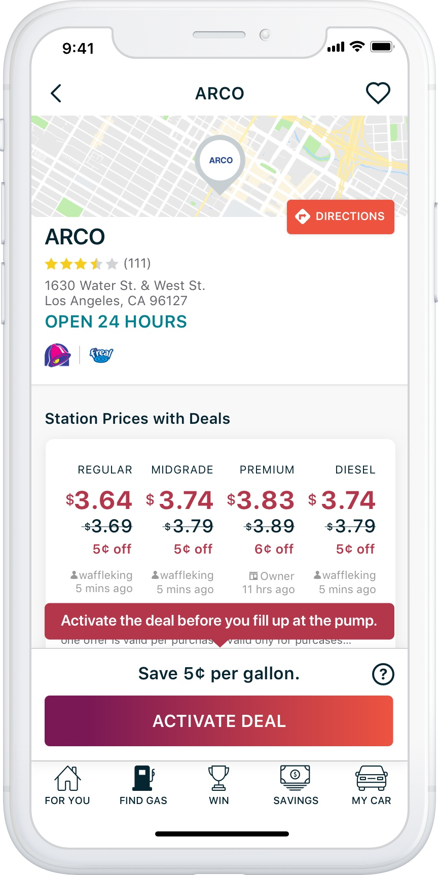
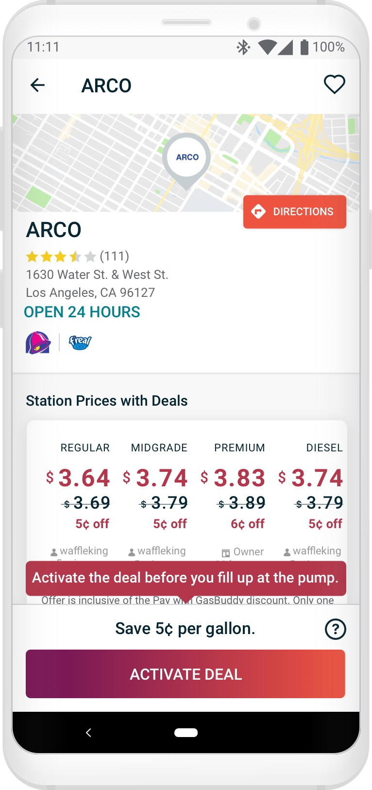
a) The implemented solution to describe an available discount for an authenticated Pay with GasBuddy users was increasing the vertical height of the “Report Prices” UI to show slashed pricing and the discounted amount, accompanied by a disclaimer in the Report Prices UI and fixed position discount UI. This both nudged any hint of the ad unit below the fold on most devices, or covered the ad unit on most devices.
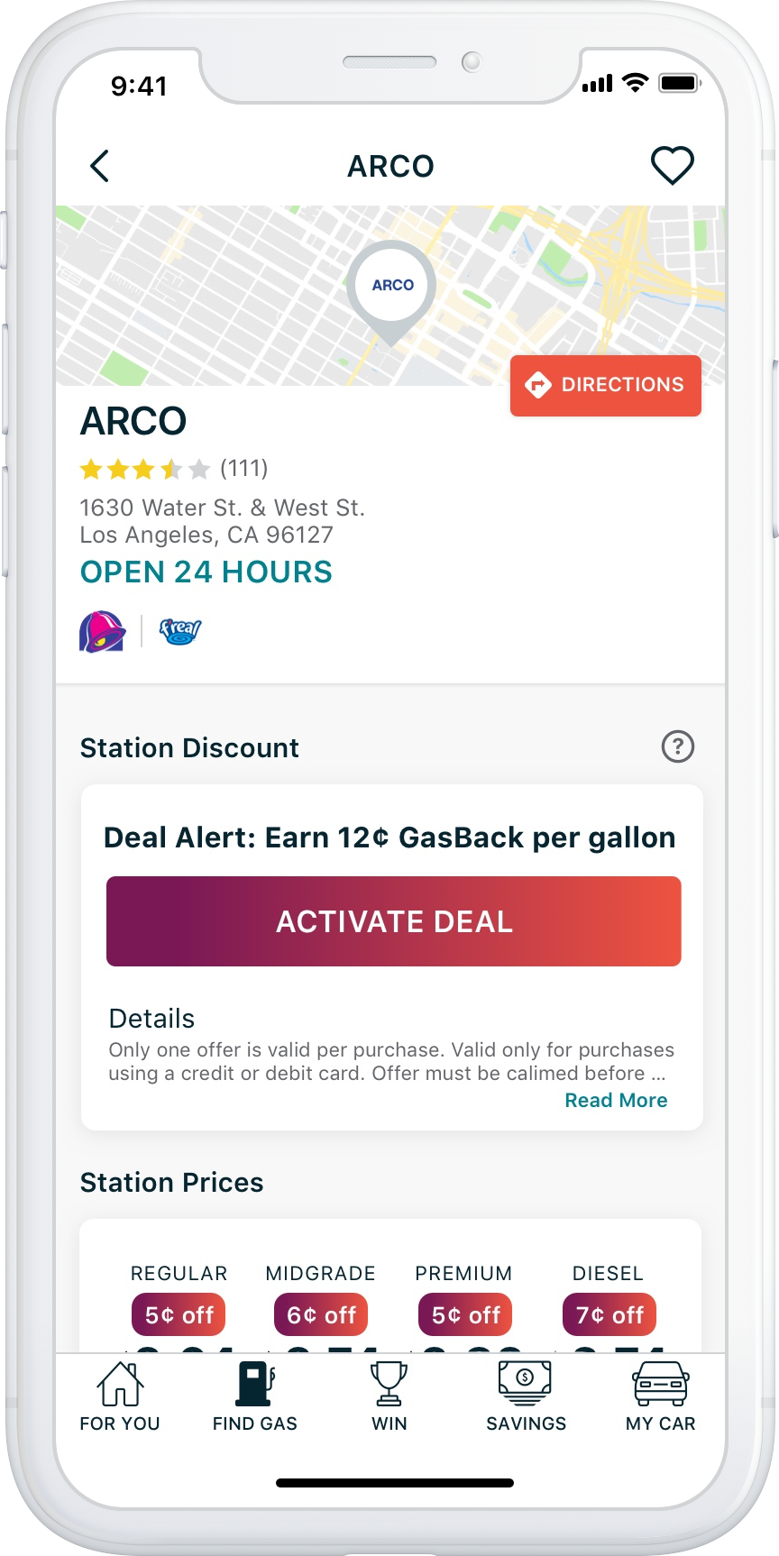
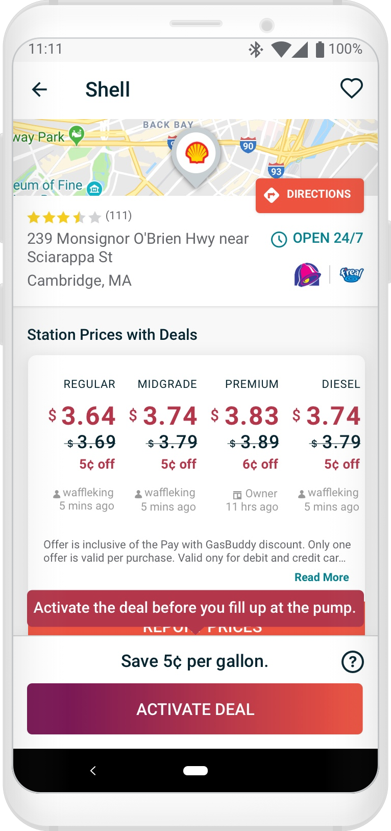
b) The implemented solution to describe and available discount for an authenticated non-Pay with GasBuddy OR logged out user was injecting a new card UI above the Station Prices UI, and adding an additional detail row to the Station Prices UI. This pushed the ad unit far down below the fold.
Problem #2
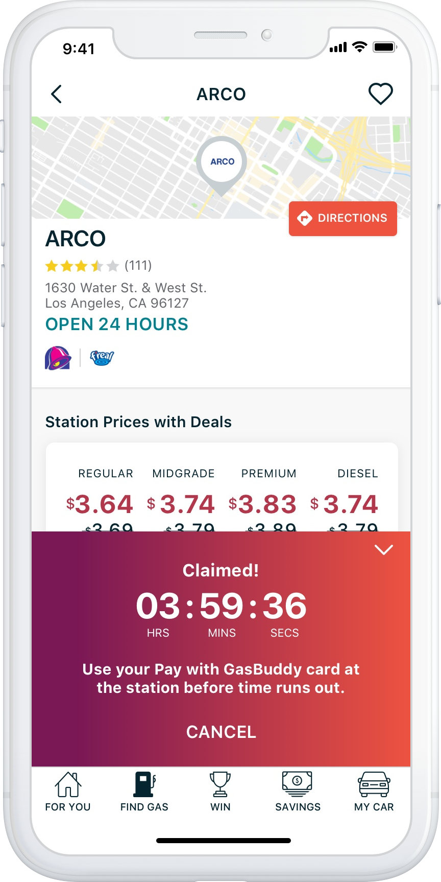
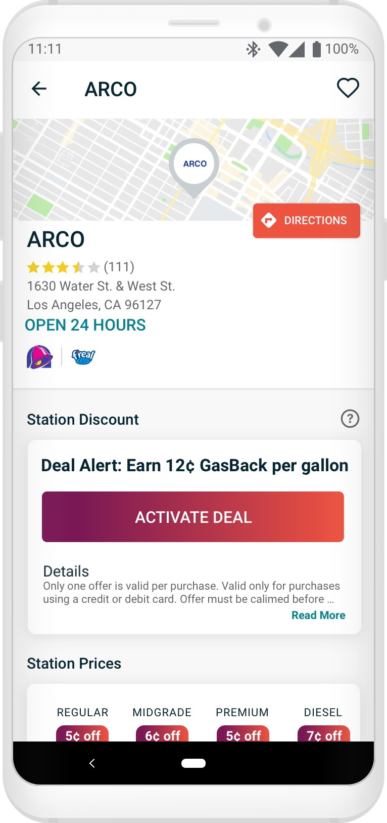
The implemented solution to communicate to the user they had activated a Deal Alert at any given station, how much time they had to claim that discount, and the time window for uploading a receipt as proof-of-purchase was to expand that floating UI, further decreasing the likelihood that the ad unit would be seen once the user returned to upload their receipt for both the Dynamic Discount and Deal Alert users.
Ad Viewability Targets
To benchmark this initiative from a monetary standpoint, I took it upon myself (with a little Q&A help from Ad Sales) to calculate the current state revenue based on the current state viewability to help build a concrete baseline to reference. It was important for me to know what the direct impact of the prior design decisions were.
Target Viewability: 70%
iOS Viewability: 30% (-25% relative decrease from previoous)
Android Viewability: 48% (-23% relative decrease from previous)
Average Viewability Between Platforms: 39%
Hypotheses & Observations 🤔
#1 – The 18% difference in viewability between iOS and Android platforms was due to the iOS app bottom bar persisting from either the Find Gas list or map views, ultimately absorbing some valuable vertical height, while Android — with far more variable screen sizes — did not.
#2 – The decrease in ad revenue could be attributed to Deal Alert and Dynamic Discount stations purposefully drawing more attention and traffic in the search list and map search views due to the way they were called out visually, resulting in more station detail opens where the ad unit was hidden or covered.
#3 – Although the Deal Alert and Dynamic Discount UI could have been contributing to missing the 70% viewability target, the default station details design (with no deals or discounts) could be missing the mark, meaning the introduction of new Deal Alert and Dynamic Discount UI was only a contributing factor to lost impressions, and not the root cause of degrading ad performance.
Shifting Focus 🔭
I realized we could net more impressions on more details screens on far more devices if we paid more attention to the default state of the details screen (a station details screen with no deals, no discounts), and not a minority subset of station details screens.
The focus shifted away from:
“How might we improve ad viewability on the Deal Alert and Dynamic Discount station details screens?”
… to:
“How might we improve the ad viewability for the default station details, while elevating the most important content on all variations of the details screen?”
Goal Identified 🥅
Make it so that 300×250 ad inventory shows 51% above the fold for most devices — on more station details screens — subsequently showing 320×100 and 320×50 ad inventory entirely above the fold on most devices, all while ensuring every variation of the station details screen maintains important information (namely: fuel prices) above the fold.
The Design 📐
The initial design request was to move and place the ad unit above the Station Prices UI to ensure guaranteed impressions, however, this would look awful and be negatively received by our users, being as such I heavily advocated against this solution 🙅
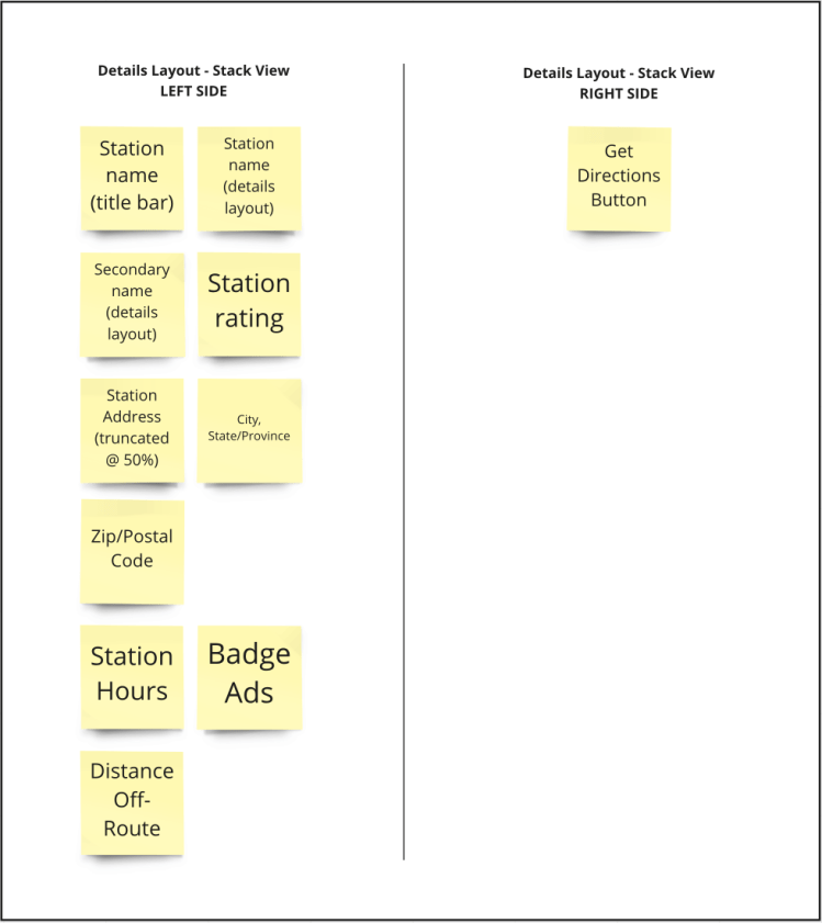
The existing design essentially used a stack view, showing several items in the left side of the details layout, which could — but not always — show:
- Station Name (also shown in the screen title bar)
- Convenience Store Name (dual branding, if applicable – not pictured)
- Station Rating
- Station Address with cross street
- City, State/Province, and Zip or Postal Code
- Station Hours
- Badge Ads (if applicable)
- Distance Off-Route (if applicable – not pictured)
This stack-view generated an impressive amount of white space on the righthand side of the details layout where the only a portion of the Directions button was partially overlaid, represented by this chart:
Considering the above, my immediate focus was on eliminating redundancy and reducing negative space.
All of the variable station info shown below the map stacks on the left side, rendering a substantial amount of negative space to the right.
With the current design audited, and the goal clearly set, I began to augment the station details screen resulting in the following design changes:
- Decrease the height of the map from 100px to 75px
- Remove the larger, redundant station name from the details stack
- Remove dual branded c-store names from the details stack
- Keep the station name in title bar
- Dual branded c-store name will be appended to station name in title bar with an “&” (if applicable)
- Station Hours button label (if applicable) was decreased from a Tertiary button style to a Quaternary style, and re-positioned below the Directions button
- Badge ads (if applicable) were positioned below the station hours, bottom aligned to the City, State/City, Province label
- Allow for station addresses to extend to, and truncate at the left edge of the DIRECTIONS button if the station has hours
- Allow for addresses to extend the full width of the screen if the station does not have hours
- Additional internal testing resulted in discovering that, although the Zip/Postal code was part of the station address, people more often than not completely missed this detail.So after some careful consideration, this was removed – as to not conflict with newly positioned badge ads
Before and After
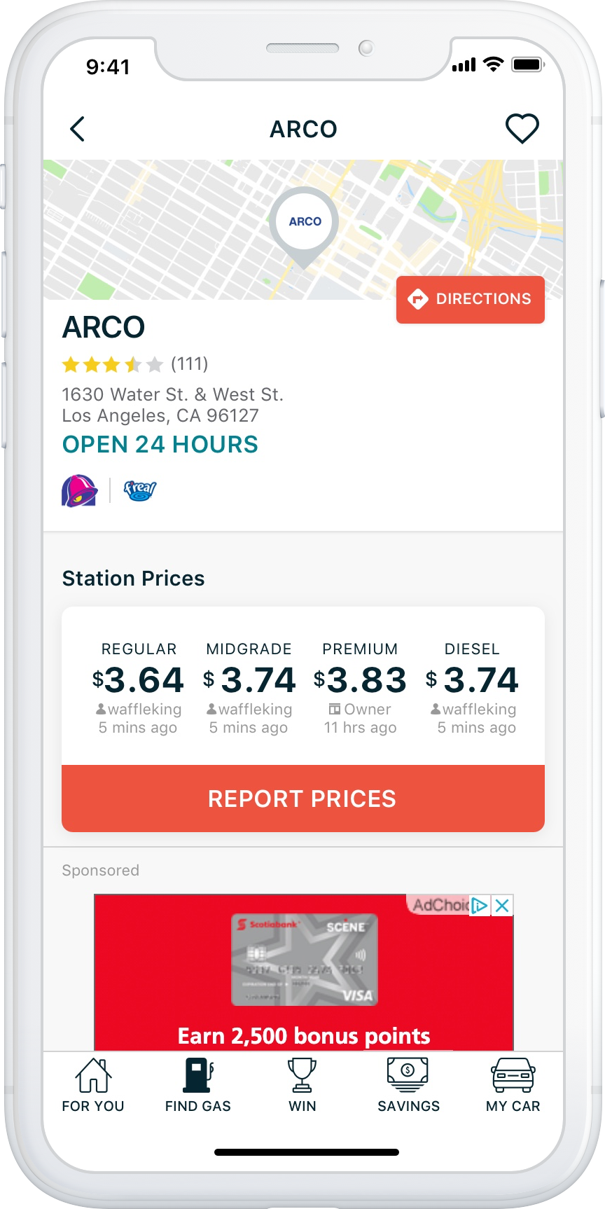
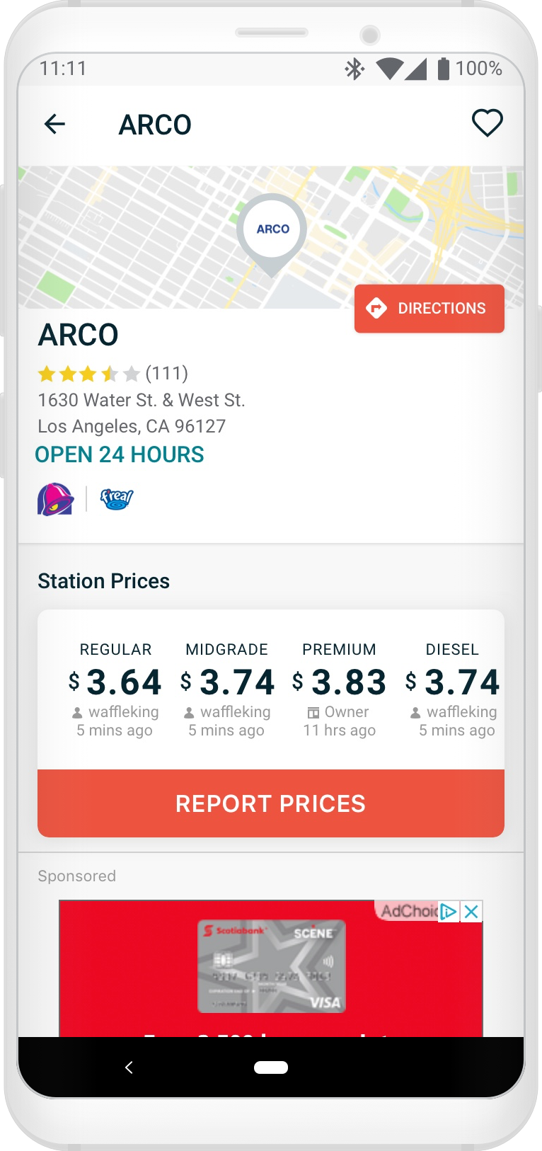
Default Station Details Screen
All in all, with a little bit of careful pixel pushing and applying some logic to all of the station details that GasBuddy users prized to keep above the fold, the above combined changes decreased the station details default layout height from ~265px to ~160 px (no business hours with a single lined address equating to a 40% reduction) OR from 265px to ~185px (with station business hours and a truncated double-lined address equating to a 30% reduction).
(drag to see side-by-side comparison)
(drag to see side-by-side comparison)
The big win for the default version of the Station Details screen — shown to significantly more users — is ensuring that the 320×250 ad inventory is shown 51% above the fold
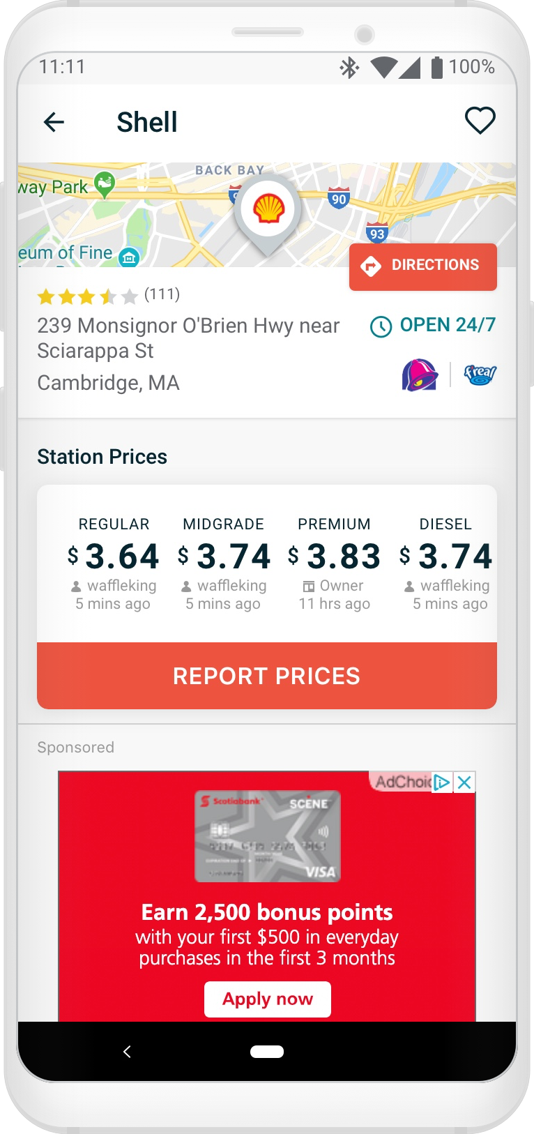
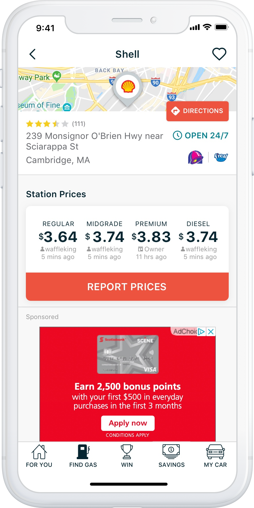
Before and After
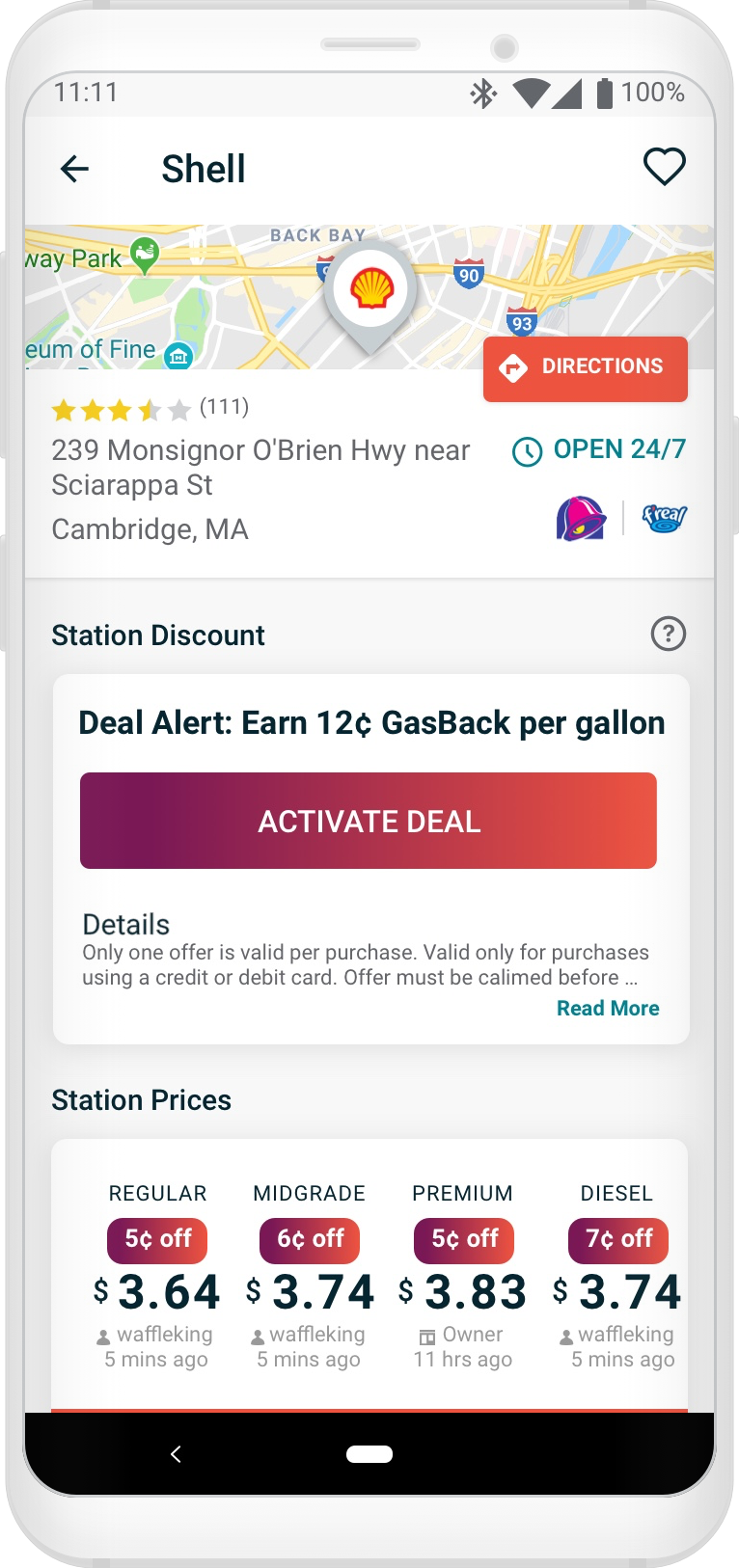
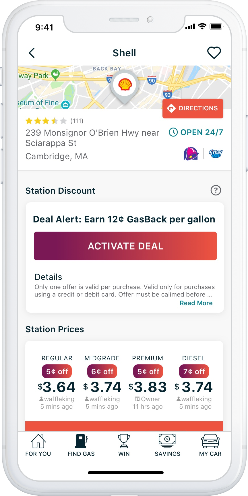
Dynamic Discounts Details Screen (Logged In)
(drag to see side-by-side comparison)
(drag to see side-by-side comparison)
The big win for this version of the Station Details Screen is getting more of the fuel price UI above the fold, and the Report Prices button uncovered once the Deal Activation tool tip is dismissed!
Before and After
Deal Alert Details Screen (Logged Out)
(drag to see side-by-side comparison)
(drag to see side-by-side comparison)
The big win for this version of the station details screen, with a significantly large promotional card UI placed above the Station Prices, is getting those prices more above the fold, and bringing that ad unit closer to the fold for when users explore the station’s ratings and reviews!
The Final Results 🎉
iOS saw a 26% absolute increase in ad viewability from 30 to 56% (or a 55% relative increase) – Not exactly 70% viewability target, but a respectable 16% absolute gain from the prior design.
Android saw a 24% absolute increase in ad viewability from 48 to 72% (or a 71% relative increase) – Meeting and exceeding the 70% target viewability and a 10% absolute gain from the prior design.
The iOS and Android apps saw a combined ad viewability improvement from 39% to 64%!
Comments or suggestions on how to improve my portfolio?
