This project is an augmentation of an existing design where users encountered a clunky UX while reporting prices from GasBuddy.com. Usability testing and a research plan were used to make improvements to the interaction and UI.
Overview
GasBuddy has been known primarily for one thing over the last 20+ years: Finding and reporting cheap gas prices. In 2017, GasBuddy.com price reporting modal, demonstrated in the view below with Blisk, was overhauled.
Blisk is an amazing tool to preview responsive web designs. Here we can see some UX issues with the previous report prices design. This is not a “mobile first” design.
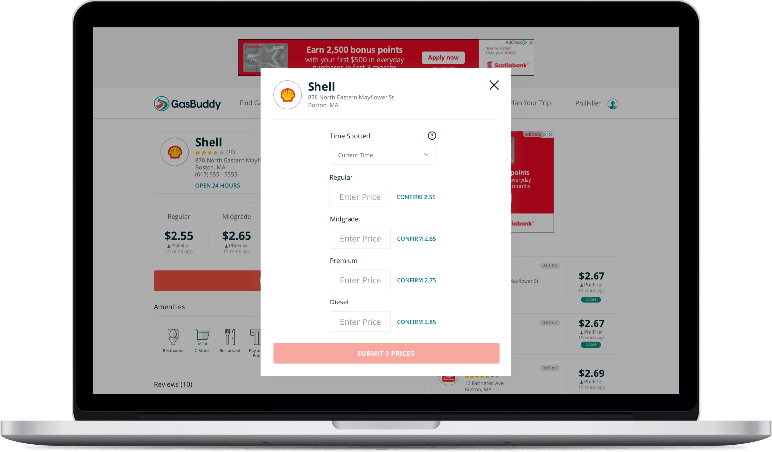
The primary issue for both desktop and mobile web users appeared to be the “circle check” icon. This “circle check” icon was acting as a confirm button used to add prices to a submit queue.
If you’re familiar with reporting prices using the GasBuddy mobile apps, the “circle check” is a display-only element used to signal that you’ve changed a price and it is ready to submit. It is only shown after confirming or changing a price. In the web experience, it was used an an element to explicitly set prices as “ready”. This interaction was the prime suspect for confusing users, leading to abandoned price reports.
Mobile web users were also presented with an unconventional requirement of having to unlock individual form fields before being able to update prices. Combined with the “circle check”, mobile web users experienced a heavier amount of friction.
Benchmark Usability Test
Before getting started on making changes to this modal, an unmoderated user test was performed on the production website via UserTesting.com to benchmark the performance of the existing design.
Target respondents were a mix of users who were familiar with reporting prices on GasBuddy.com, users who had never submitted prices on GasBuddy.com, and users who were familiar with reporting prices using the GasBuddy mobile apps.
The results of this benchmark test were predictable: The current design was not working due to the “circle check” icons, people were getting confused and abandoning price reports.
Iterative User Testing
A new design was created and iterated upon involving:
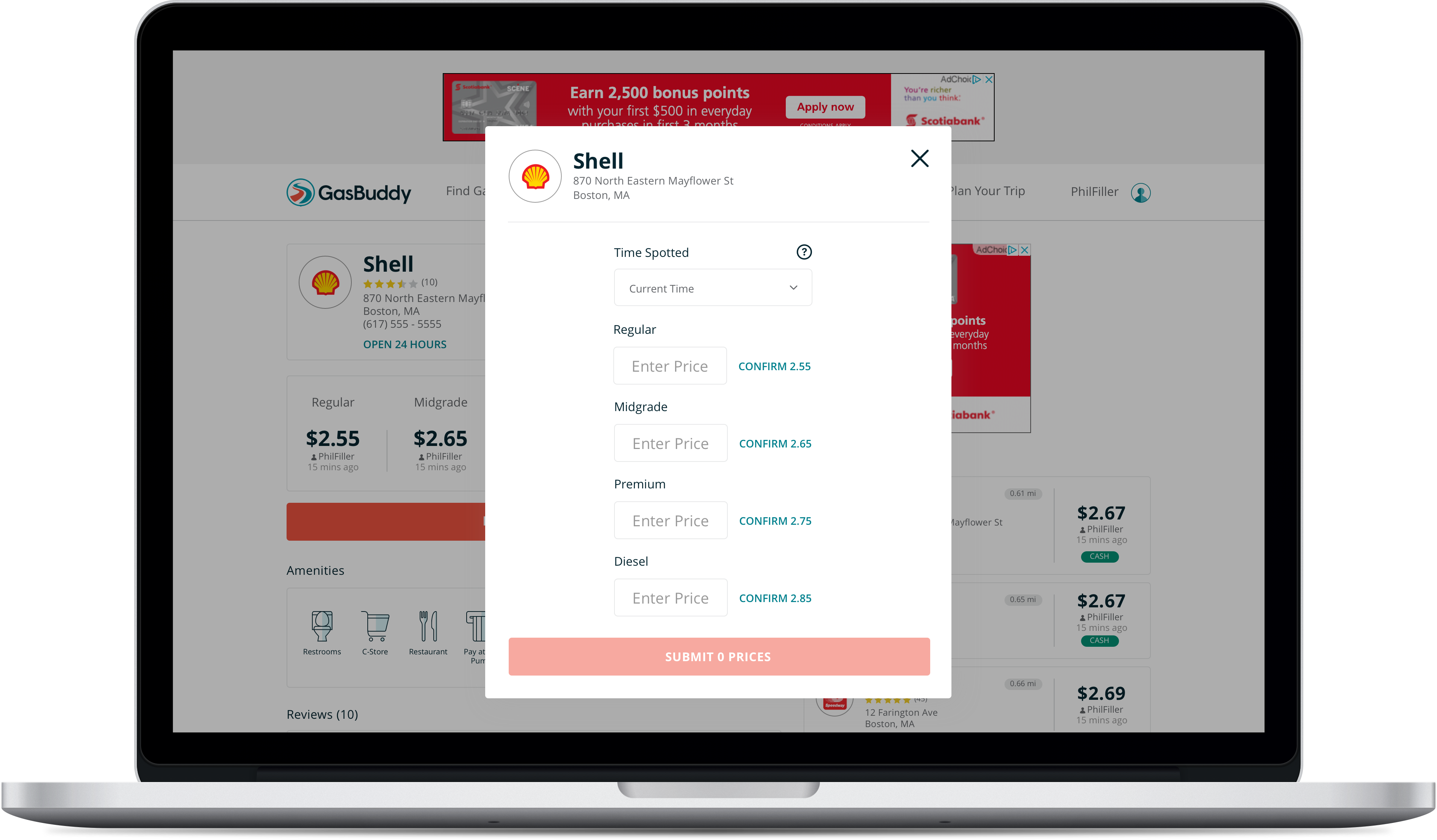
- Adopting “Confirm {Price}” CTA’s for existing prices from the mobile apps
- Moving “Time Spotted” above the prices for Desktop users, with a tool tip (this is explicitly a web feature to help ensure Desktop price report users don’t accidentally overwrite more current prices)
- Allowing for the price report modal to gracefully handle scrolling on mobile devices (and in some cases, desktop)
- Allowing for inline price validation (ie. “Too high”, “Too low” messaging)
- Changing the interaction of this modal from “Enter a price, then confirm it, then submit it” to “Enter a price, then submit it”
You can find the test plan here and the short form report here.
There was also an opportunity here to introduce a completion message pointing to GasBuddy’s Daily Prize Draw. GasBuddy users receive points for updating prices. At the time of creating this project page, aside from the new completion messages shown at the end of reporting prices, GasBuddy still does not value prop the Daily Prize Draw, or provide clear access to the Daily Prize Draw.
Before and After – Desktop
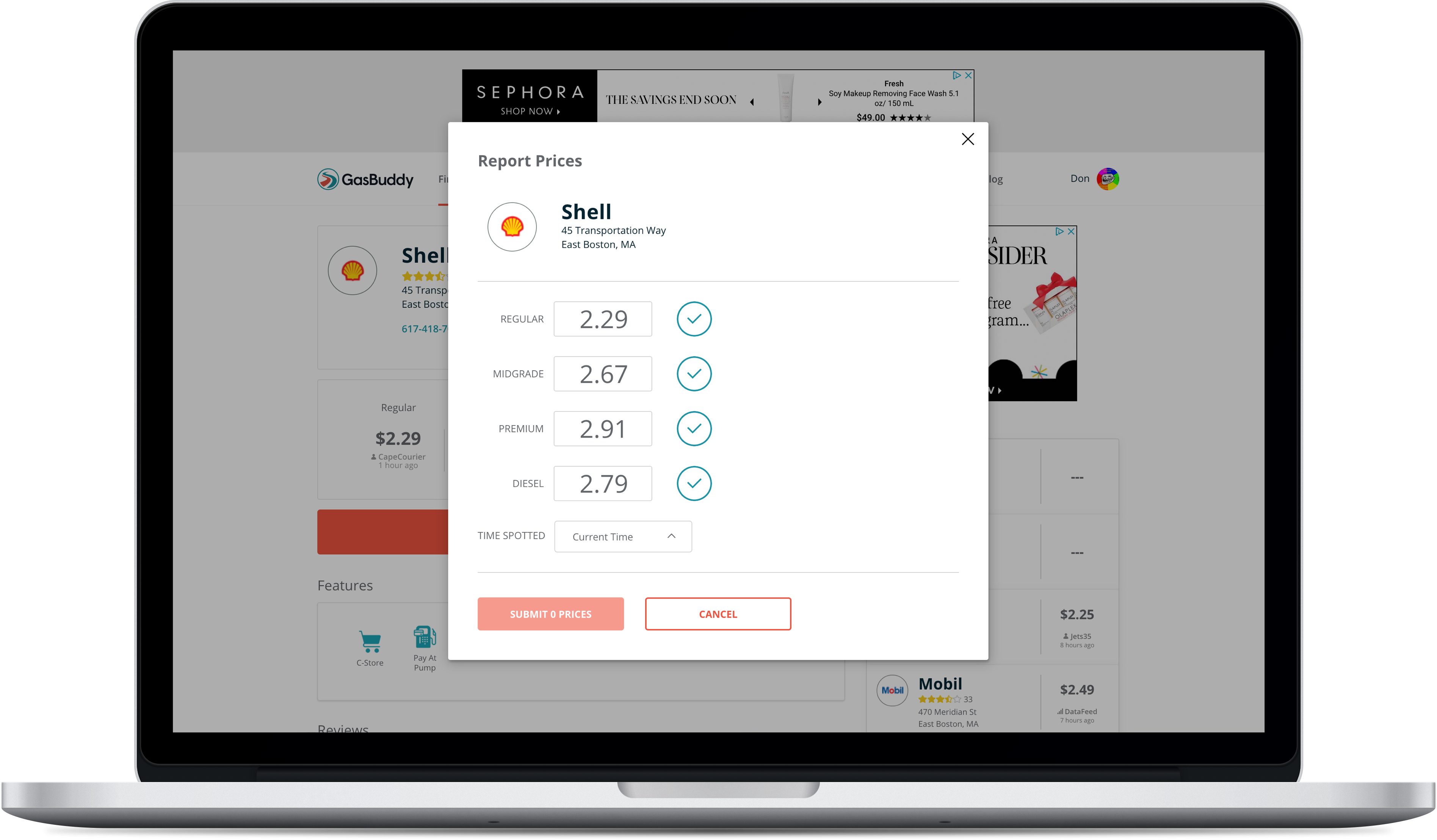
Click to see full size in browser
Click to see full size in browser
Before and After – Mobile Web


