Overview
For this initiative, I was tasked with augmenting an existing design for a price entering form on GasBuddy.com. A research plan was created and usability testing was conducted to make improvements to the overall web experience price reporting UX.
The goal of this design was to reduce the friction encountered while reporting prices from the GasBuddy website, but that isn’t where things stopped.
I’ve found that if time and effort are going to be allocated to fix something, it may be worthwhile to inspect other moving parts and pieces to see what can also reasonably be improved at the same time, or as fast-follows. With scope-creep considerations, of course.
Background
GasBuddy has been known primarily for one thing over the last 20+ years: Finding and reporting cheap gas prices.
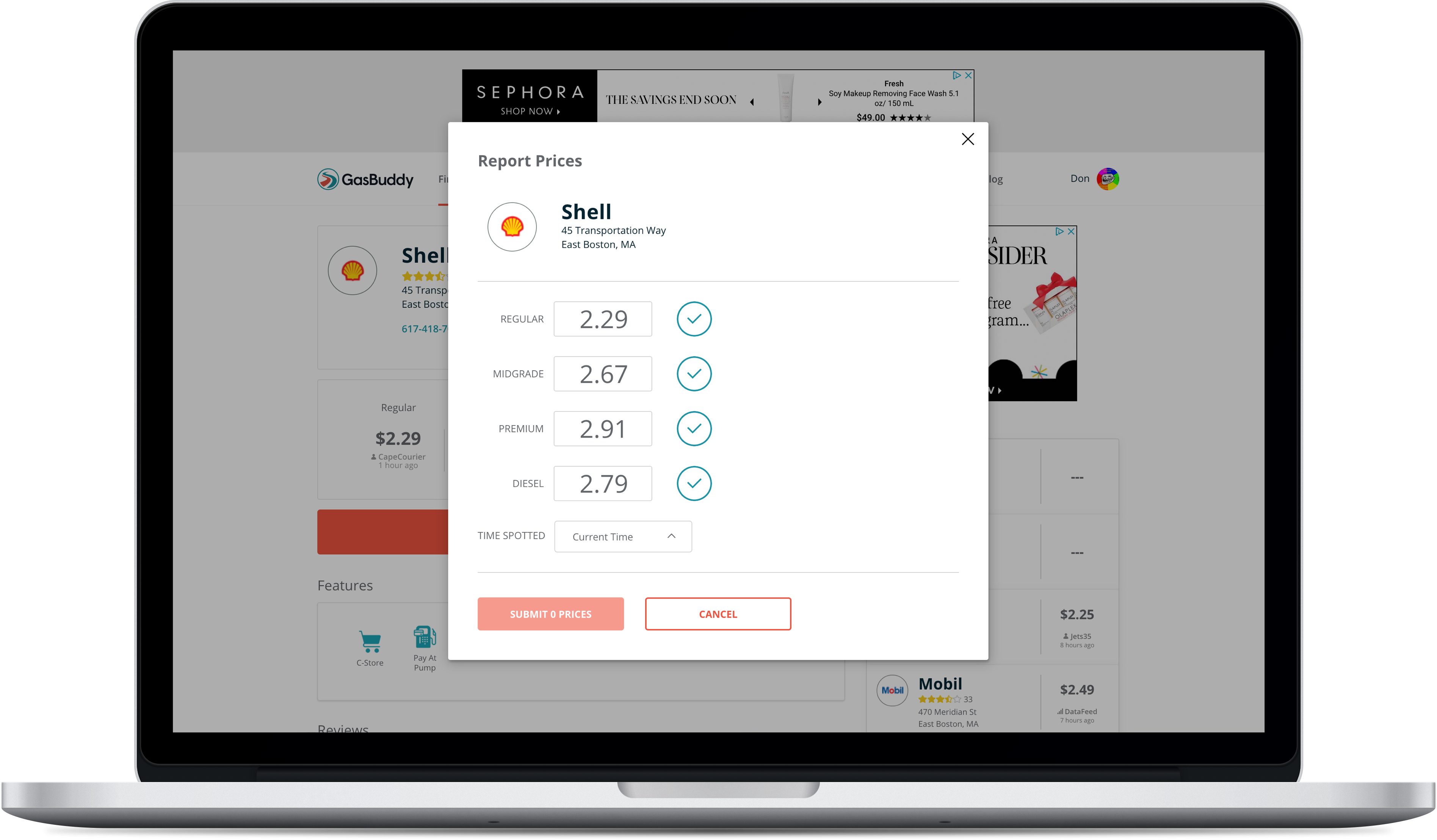
In 2017 the GasBuddy.com price reporting modal was updated to what you see demonstrated below, captured with Blisk:
With the 2017 design changes, and with a shift in priorities, the engagement of web price reporting had began to steadily decline.
Hypotheses & Observations 🤔
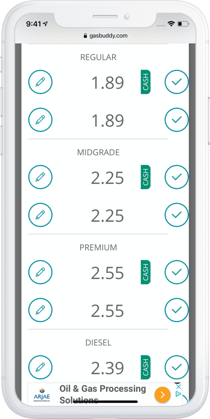
The initial hypothesis and suspect observation for both desktop and mobile web users abandoning their price reporting was the “circle check” icon.
This “circle check” icon was serving as a confirm button being used to add prices to a submit queue.
If you’re familiar with reporting prices using the GasBuddy mobile apps, the “circle check” in the context of price reporting is a display-only element used to signal that you’ve changed a price and it is ready to submit, and is only shown after confirming or changing a price.
In the web experience, it was used an an element to explicitly set existing prices as “ready to submit”. This interaction was the prime suspect for confusing users, leading to a high number of abandoned price reports (or incomplete price report interactions).
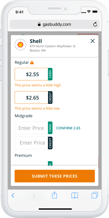
Mobile web users were also presented with an unconventional requirement of having to unlock individual form fields by tapping “edit” icons before being able to update prices, experiencing a much higher level of unnecessary friction.
Benchmark Usability Testing
Before getting started on making any changes to the web experience price reporting modal, an unmoderated user test was performed on the production website via UserTesting.com to benchmark the performance of the existing design.
Target respondents were a mix of users who were familiar with reporting prices on GasBuddy.com, users who had never submitted prices on GasBuddy.com, and users who were familiar with reporting prices using the GasBuddy mobile app(s).
The results of this benchmark test proved the hypothesis: The current design was not working due to the “circle check” icons — users were getting confused and abandoning price reports, and they were doing so under the impression that clicking or tapping on the circle-check icon was submitting the prices.
You can find the test plan here and the short form report here.
Iterative User Testing
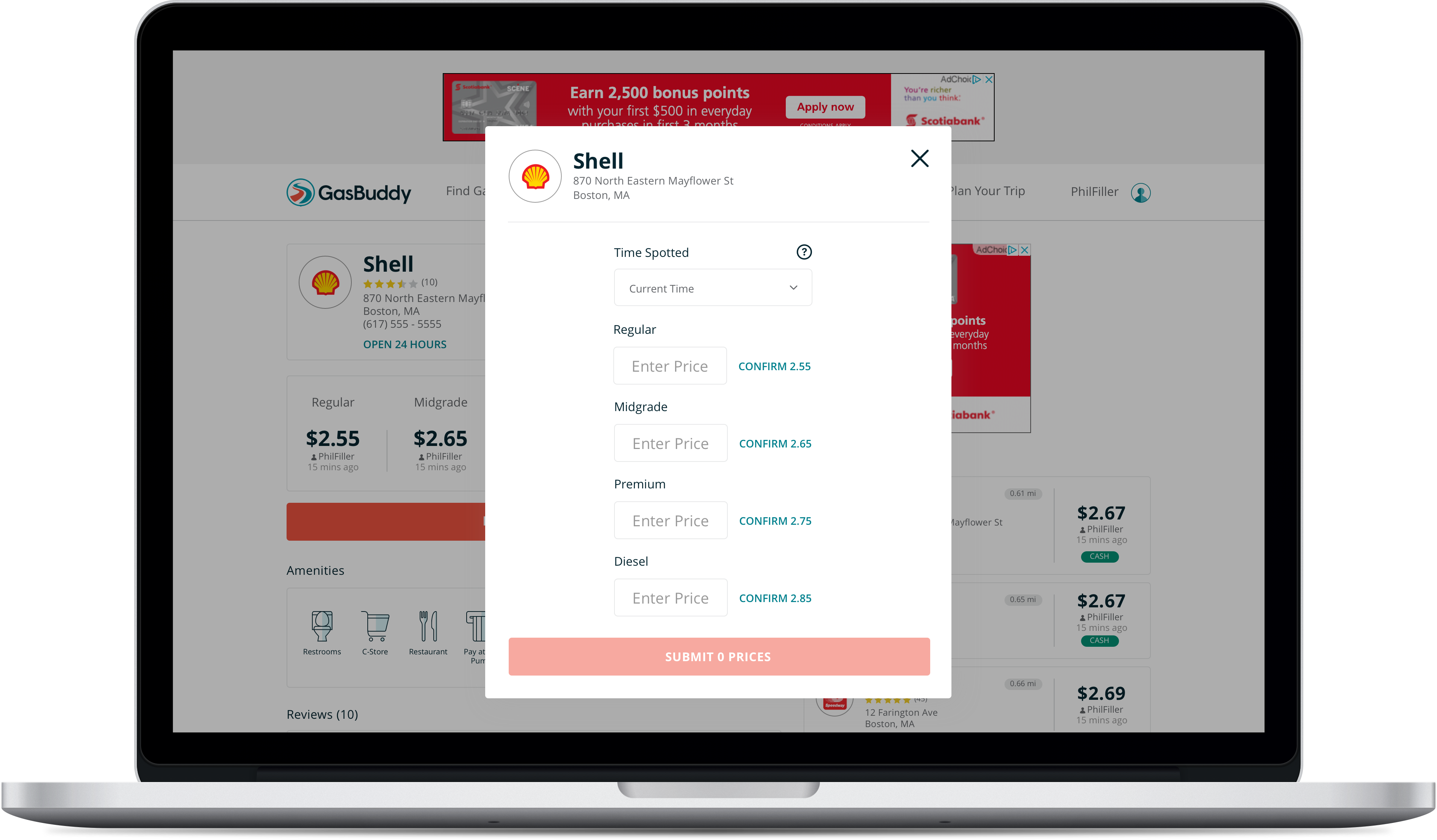
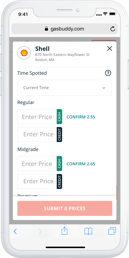
A new design was created and iterated upon involving changes such as:
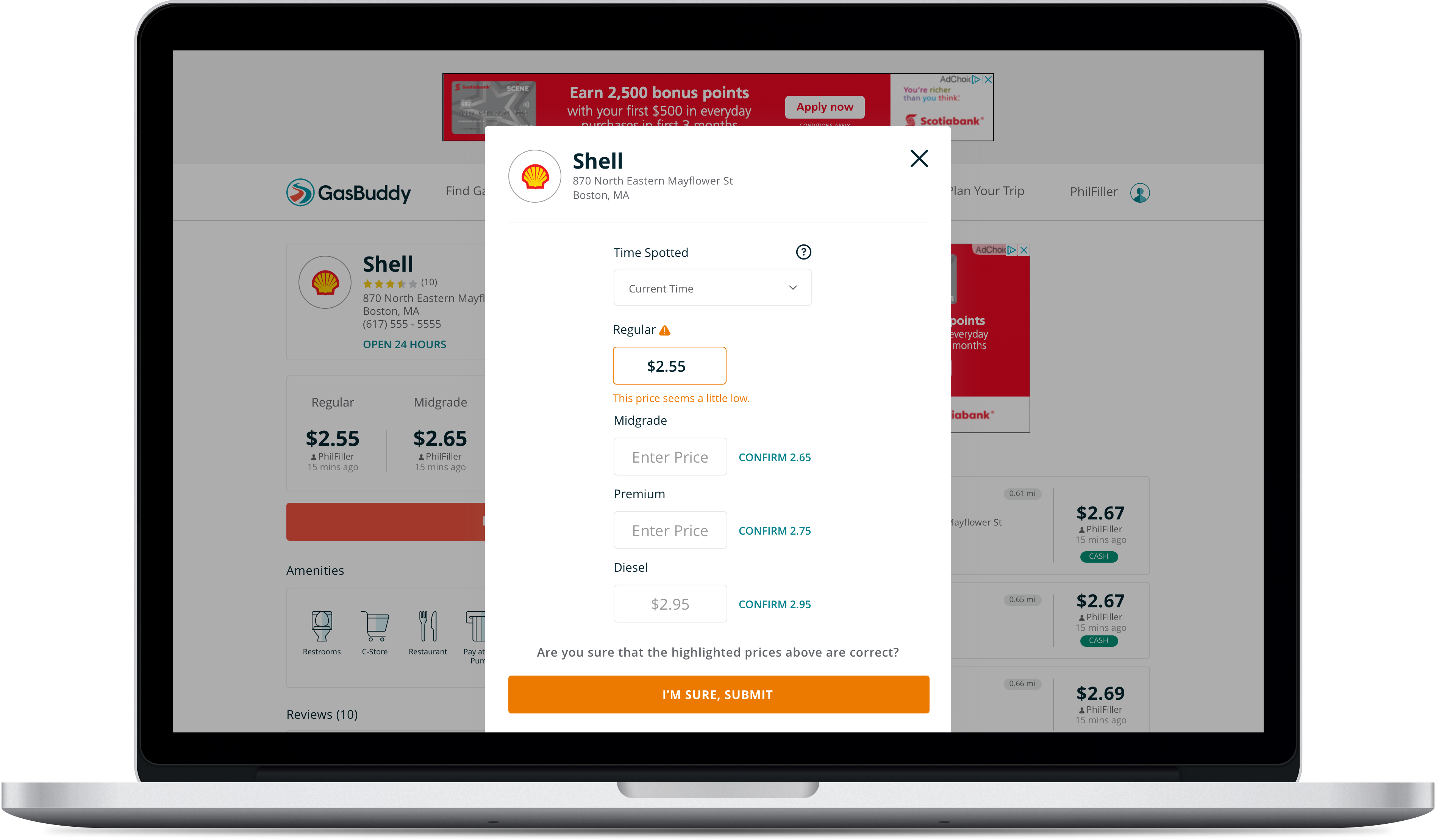
- Adopting the “Confirm {Price}” CTA’s for existing prices from the mobile apps to replace the “circle-check”
- Moving the “Time Spotted” date/time picker above the prices for Desktop users, with a tool tip (this is explicitly a web experience feature to help ensure users don’t accidentally overwrite more recent price reports)
- Allowing for the price report modal to gracefully handle scrolling on mobile devices (and in some cases, desktop)
- Changing the interaction of this modal from “Enter a price > Confirm a price > Submit price” to “Enter a price > Submit Price”
- The final change, albeit a slightly contentious one, was to remove the 320×50 banner ad at the bottom of the price reporting modal in the mobile web experience
- There was a suggestion to include an ad unit to the mobile app price reporting modal — as a frequently visited screen — however, this idea was heavily discouraged and it seemed appropriate to apply the same decision-making to the mobile web experience
Desktop: Before & After
Mobile Web: Before & After
What’s More?
Although the web price reporting UI was refreshed, there were other aspects of the user’s price reporting experience that I identified as needing improvement, primarily in the arena of giving users important, or delightful, instant feedback for their contributions.
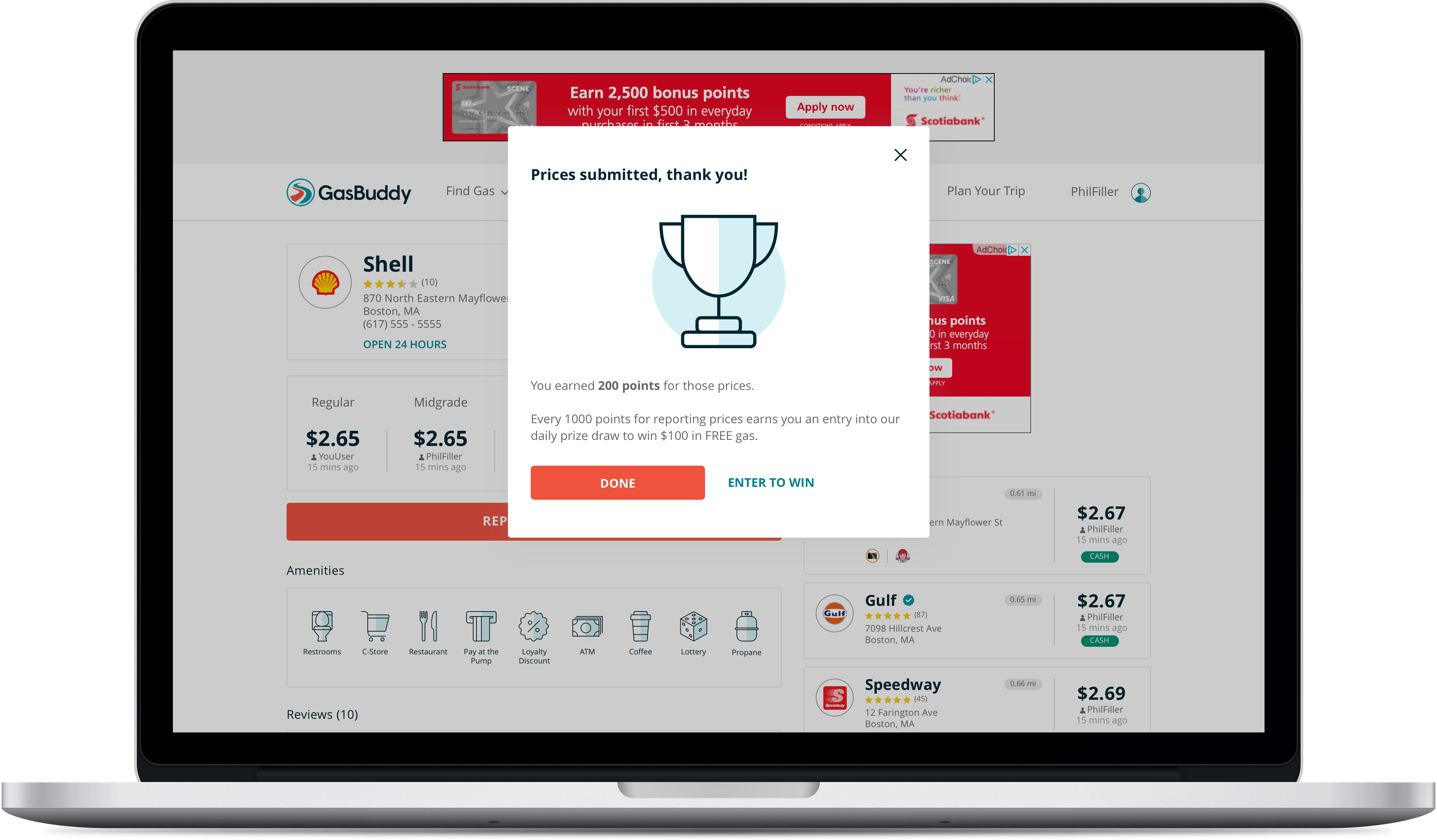
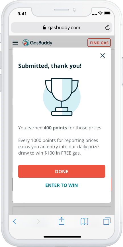
GasBuddy users receive points for updating prices.
In the previous web experience, GasBuddy users did not receive any kind of instant feedback on their price reporting contributions — whether it be during their price entry or after submitting prices — or receive any kind of signal that their price reports were valuable or appreciated, which was inconsistent with our mobile app experience.
This new design introduced a completion message showing users what amount of points they had received for their contributions. This message also pointed users toward GasBuddy’s daily prize draw for a $100.00 gift card, where points were exchanged for entries into the daily draw. This opened up the door for the web experience to also include “Challenge Completed” messaging , wherein the GasBuddy mobile apps presented users with a success message indicating if their prices contributed toward them completing a Challenges (an engagement tactic).
This new design also introduced inline price validation (“price seems high”, “price seems low” warnings) to help improve GasBuddy’s price data quality, and to prevent users form submitting accidental or erroneous prices.
The GasBuddy apps were the only products to have this kind of experience to both help improve price reporting accuracy and show users appreciation for their contributions — these changes brought parity between the web and mobile app experience.
UX Improvement #1 – Inline Validation
UX Improvement #2 – Completion Message
The Final Results 🎉
Two months following the release of these changes, we could see a 10% absolute increase in the number of users completing prices reports. More importantly, we saw the number of occurrences for users submitting prices increase by 11%. This was very important for the web experience, which had been seeing a decline in usage.
The number of users submitting entries into the daily prize draw also increased by 9%, of which we saw the number of occurrences for users entering the daily prize draw increase by 5%.
Comments or suggestions on how to improve my portfolio?
