Overview
For this initiative, I was tasked with creating alternative Download App page designs to test against the current/control Download App page.
It had been communicated that app downloads from this page were on the decline, and a group of individuals from different disciplines were tasked with improving download conversions from this page.
This project involved tight coordination between a third party SEO consultant to maximize page rankings, GasBuddy’s Creative Services (Marketing) team to provide copy, content, and a direction that aligned — or rather — worked with the SEO recommendations, and myself to construct a templatized page that met requirements.
The Goal 🥅
To implement a strong ranking SEO download app page showing multiple value props to entice prospective users into downloading the app, and drive higher download conversion rates
Observations 🤔
My initial observation of the control was that it was not mobile-first (actually, no mobile web design resources could be procured).
The control is a simple page that displayed a generalized value prop, with an SMS Download App link and accompanying app marketplace buttons:
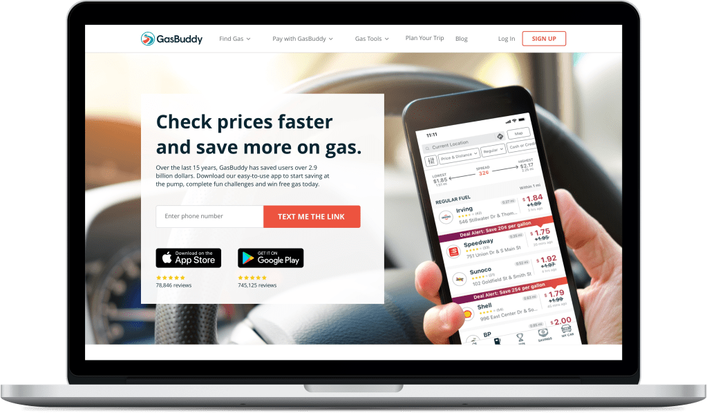
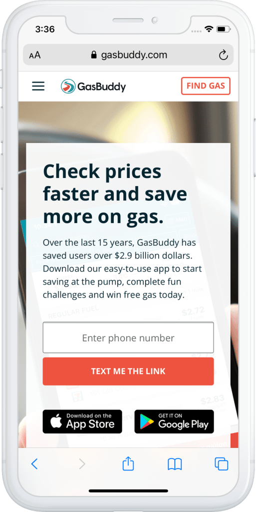
I take no credit for the above designs that depict the control/previous state of the download app page.
Competitive Analysis 🎯
Prior to hitting the drawing board, I performed a competitive analysis to see what other companies were doing with their download app pages, compared to our own.
Some inspiration drawn from a few of the “competitors”:
- Try to maintain a 1:1 attention ratio for the task at hand (downloading the app)
- Mobile web users were provided with a navigation bar that had no distracting “FIND GAS” CTA in the upper right corner
- Mobile web users were provided with a floating bottom banner directing them to the marketplace suited for their device (iOS = App Store, Android = Play Store)
- As desktop users scrolled on the page past the initial Download App SMS link and marketplace buttons, a bottom floating banner presented itself offering the same marketplace and SMS download options
- Large content blocks to encourage scrolling and showcasing various value props were implemented
- A device casing carousel rotating through the mobile app product screens was included
The Design 📐
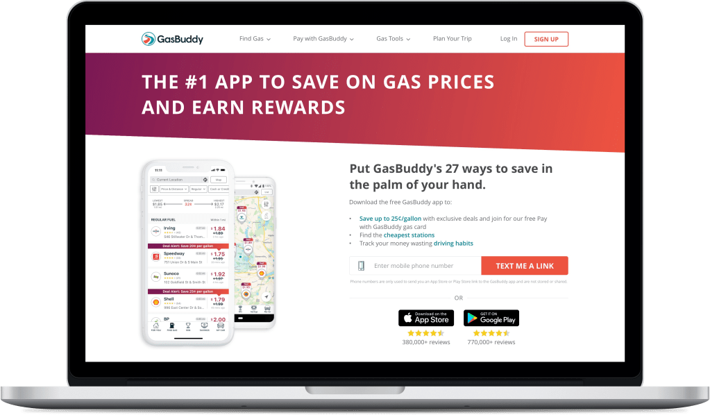
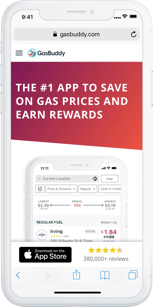
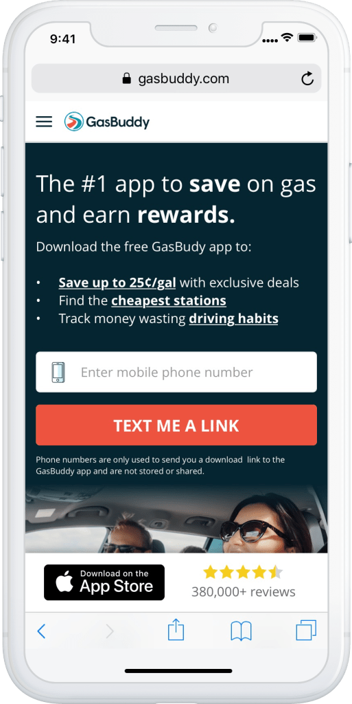
Variant A – Gradient Banner
GasBuddy had adopted what we referred to as Angled Gradient Banners for page headers. The first variant would use this kind of page header to be more in sync and consistent with the latest direction of the GasBuddy.com home page and other interior pages.
This was a mobile first design that detected which OS the user was browsing from to provide them with only relevant App Store or Google Play buttons.
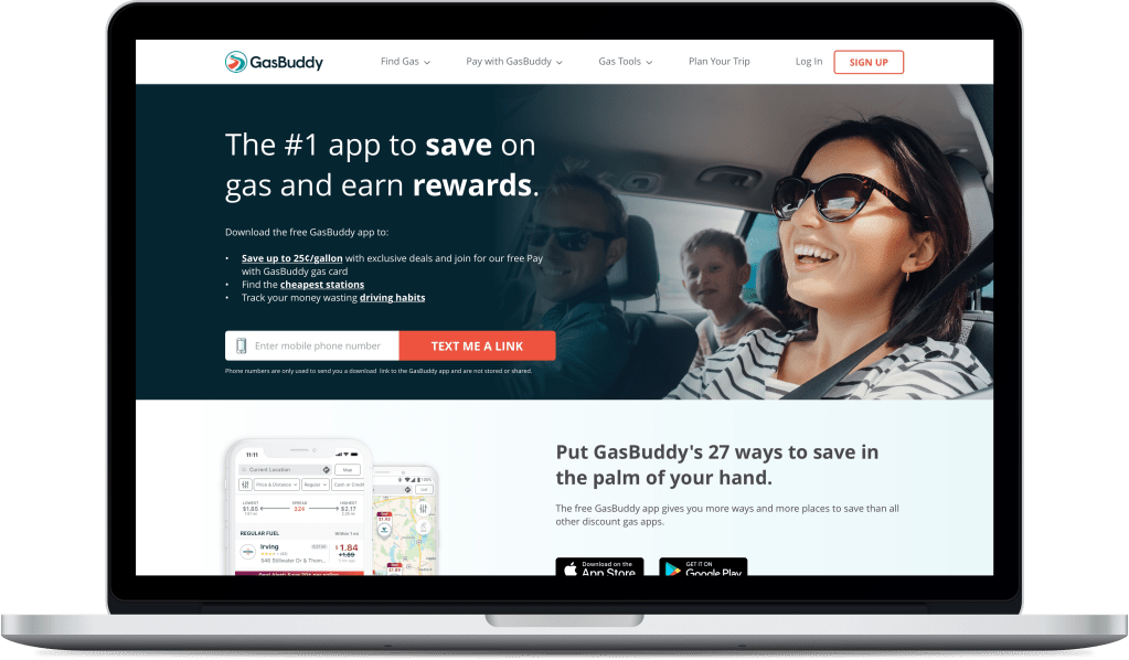
Variant B – Lifestyle Image
GasBuddy had recently been experimenting with testing the use of lifestyle images. For this download app page variant we chose a similar design to the latest Pay with GasBuddy landing page, as that test had performed well.
This was also a mobile first design that detected which OS the user was browsing from to provide them with only relevant App Store or Google Play buttons.
Learnings 📖
Ultimately the test variants did not outperform the control.
By this, I mean all variants, including the control, performed the same.
The test results were, unfortunately, inconclusive…*womp womp*
It is hypothesized that the new design for this page, which featured several promotional content blocks, testimonial quotes, a device casing carousel of product screenshots, and SEO verbiage & tactics (indexing, inner-page navigation of anchored links) overcomplicated and obfuscated the explicit, sole purpose of the page.
… It’s also quite possible that users who landed on this page to download the app already had a high intent to download, and therefore, didn’t need to scan or explore the page any more than before.
Comments or suggestions on how to improve my portfolio?
